Designing a Brand that Makes Travel Feel Purposeful, Playful, and Personal

Brand Philosophy & Strategy
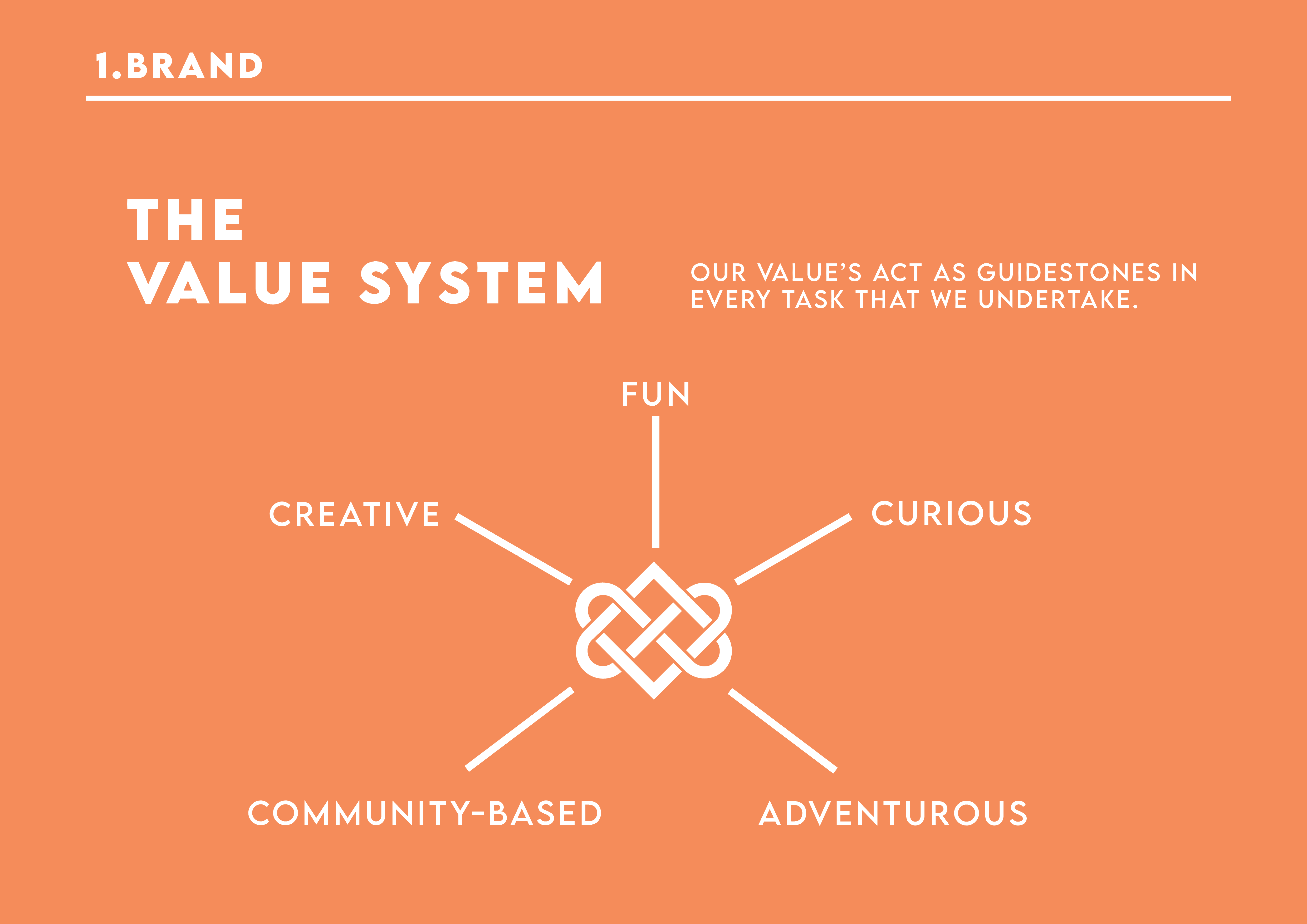
Travokarma is a change-making travel platform reimagining exploration through the lens of impact and community. The mission: to build a fun, conscious collective of travelers driven by karma — the belief that doing good leads to meaningful outcomes. This identity needed to feel lighthearted but powerful, global yet grounded. The strategy centered on balancing joy, curiosity, and purpose. With its optimistic voice, the brand invites people to reflect on their journey while encouraging thoughtful action, community participation, and cultural exchange. Travokarma’s vision is to grow into a global movement of individuals who see travel not just as escape — but as empowerment.
Visual Identity & Execution
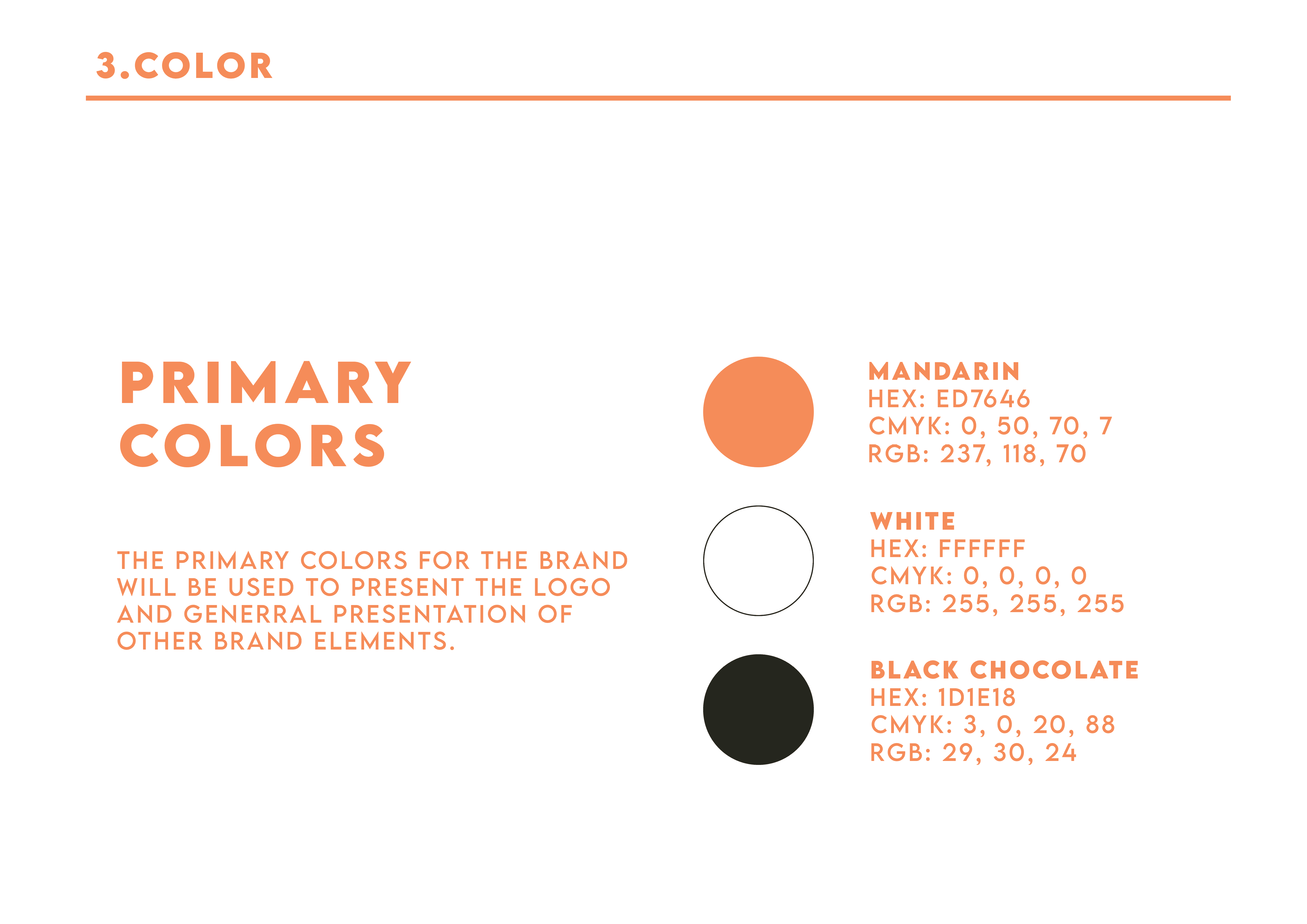
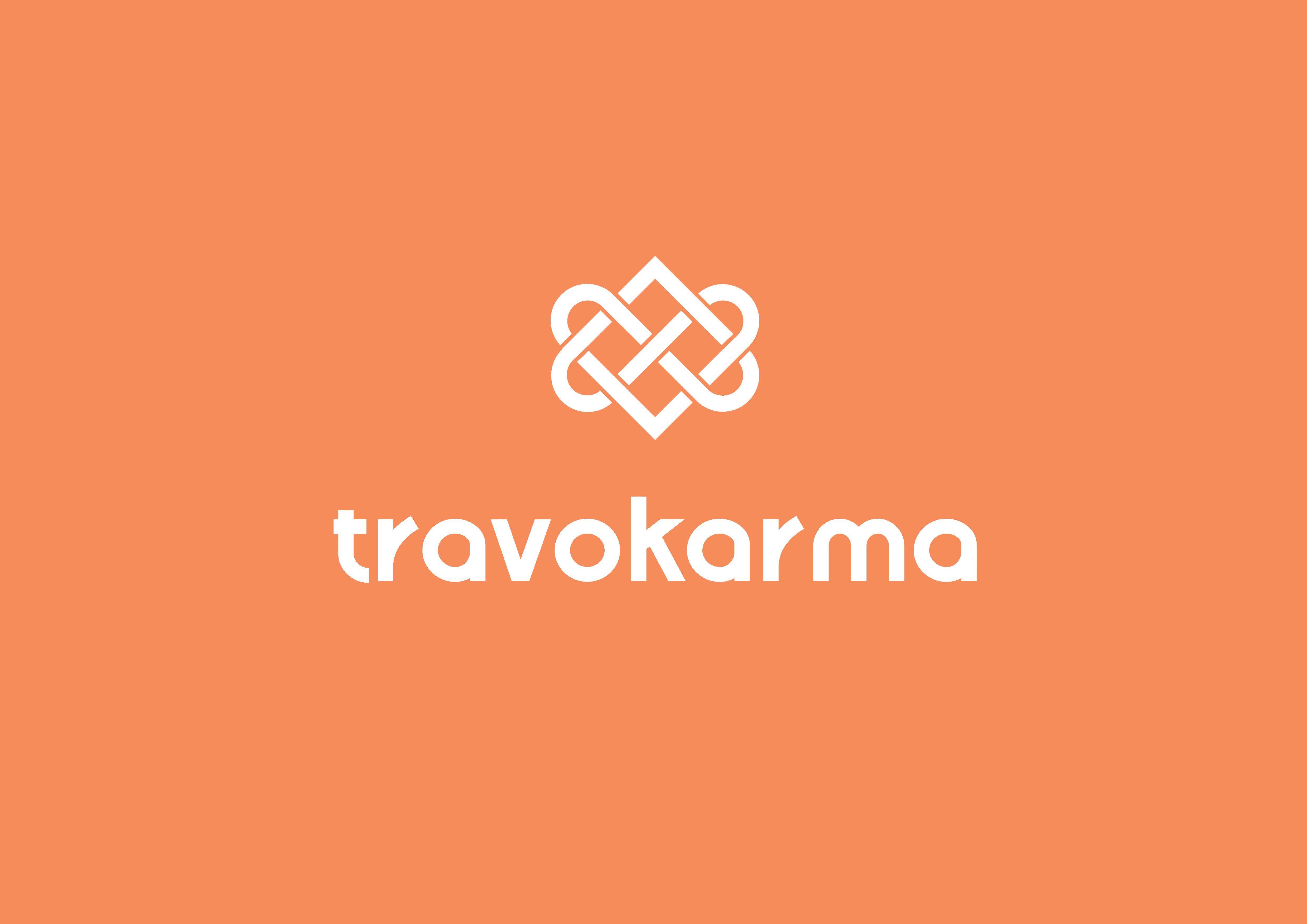
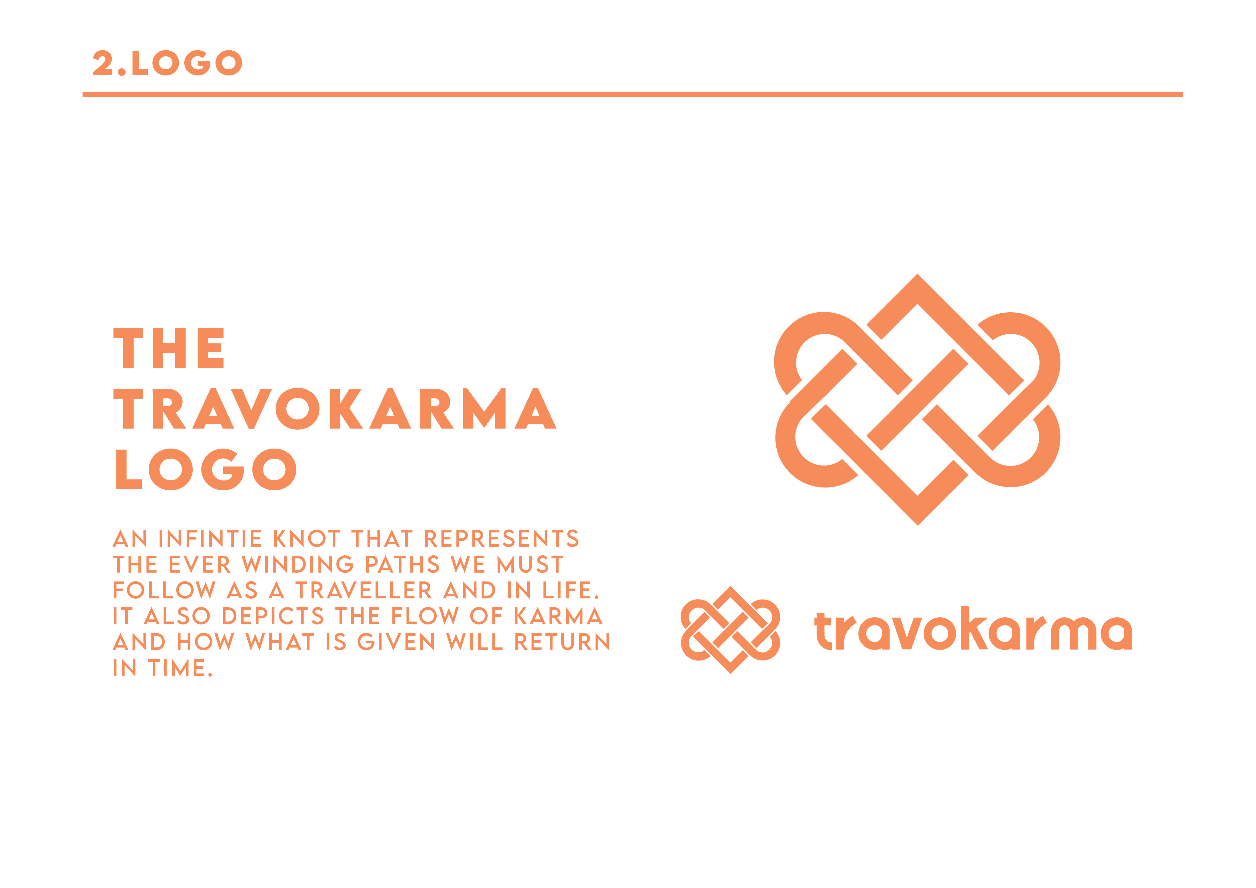
The logo is built around an infinite knot, symbolizing interconnectedness, journeys, and the cyclical nature of karma. Its geometry is rooted in simple shapes — circles and rectangles — keeping the mark clear and versatile across media. The color palette is vibrant yet earthy:
Mandarin Orange (#ED7646) brings energy and approachability
Black Chocolate (#1D1E18) adds grounding sophistication
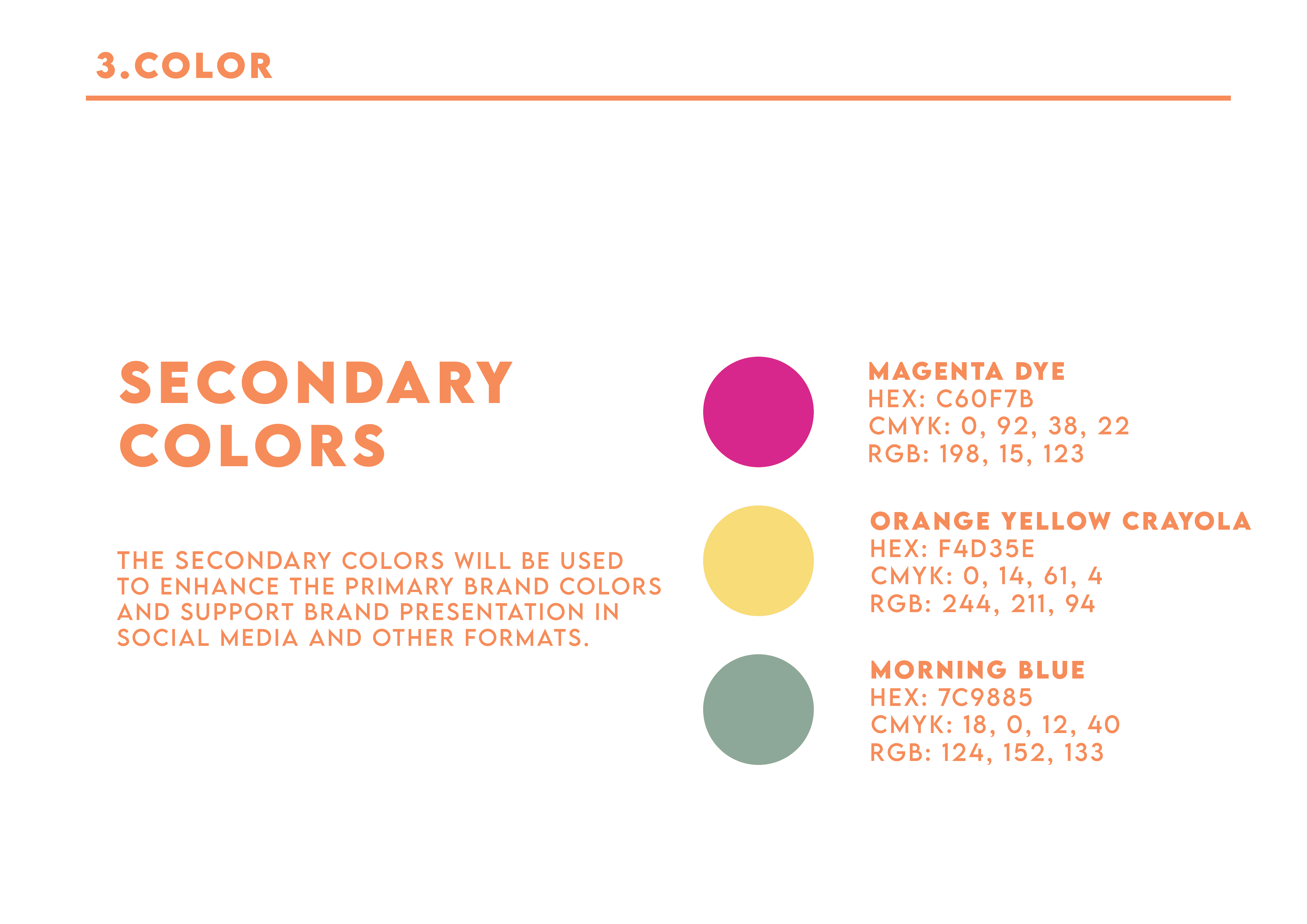
Magenta Dye, Morning Blue, and Crayola Yellow enrich social and digital contexts
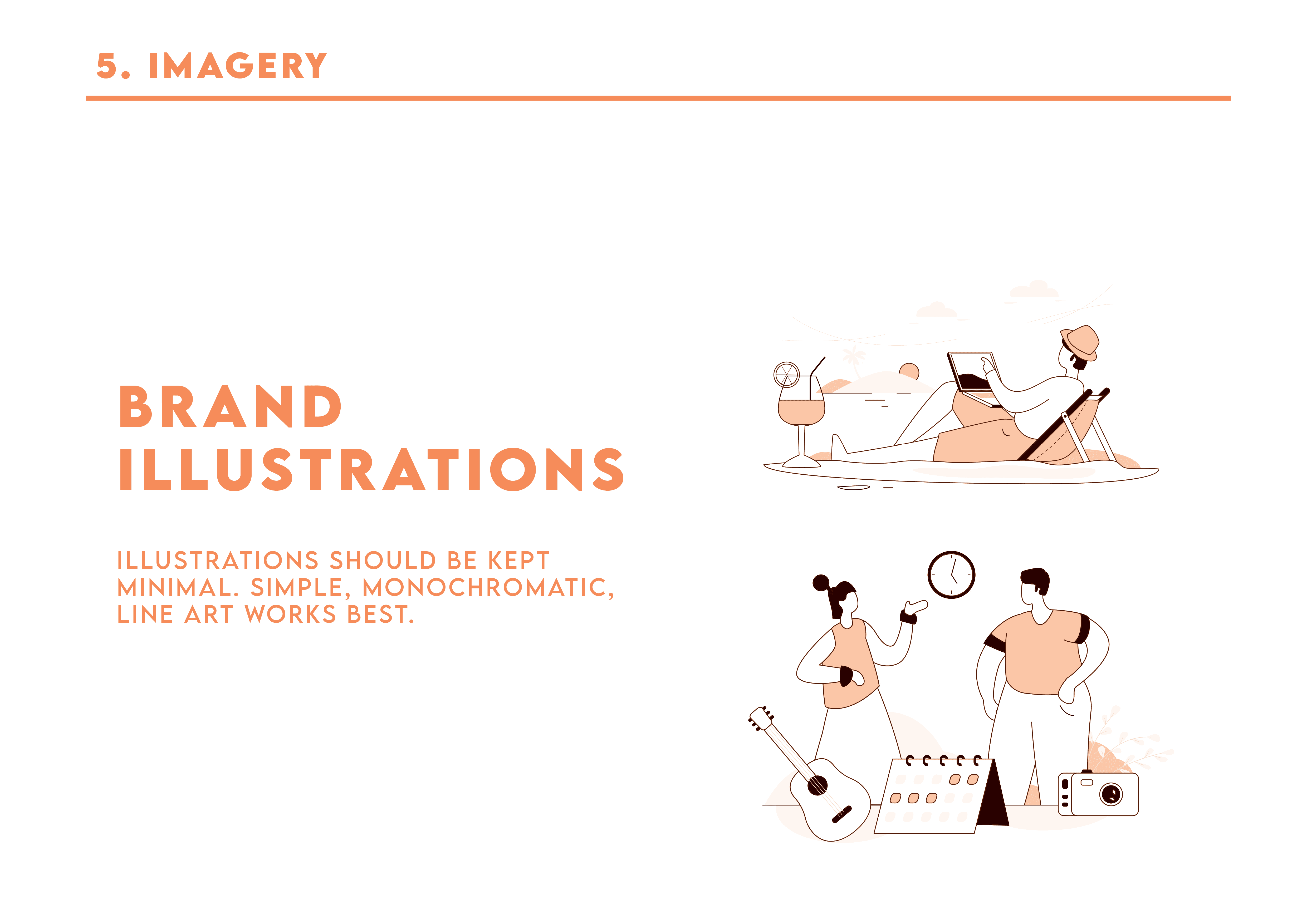
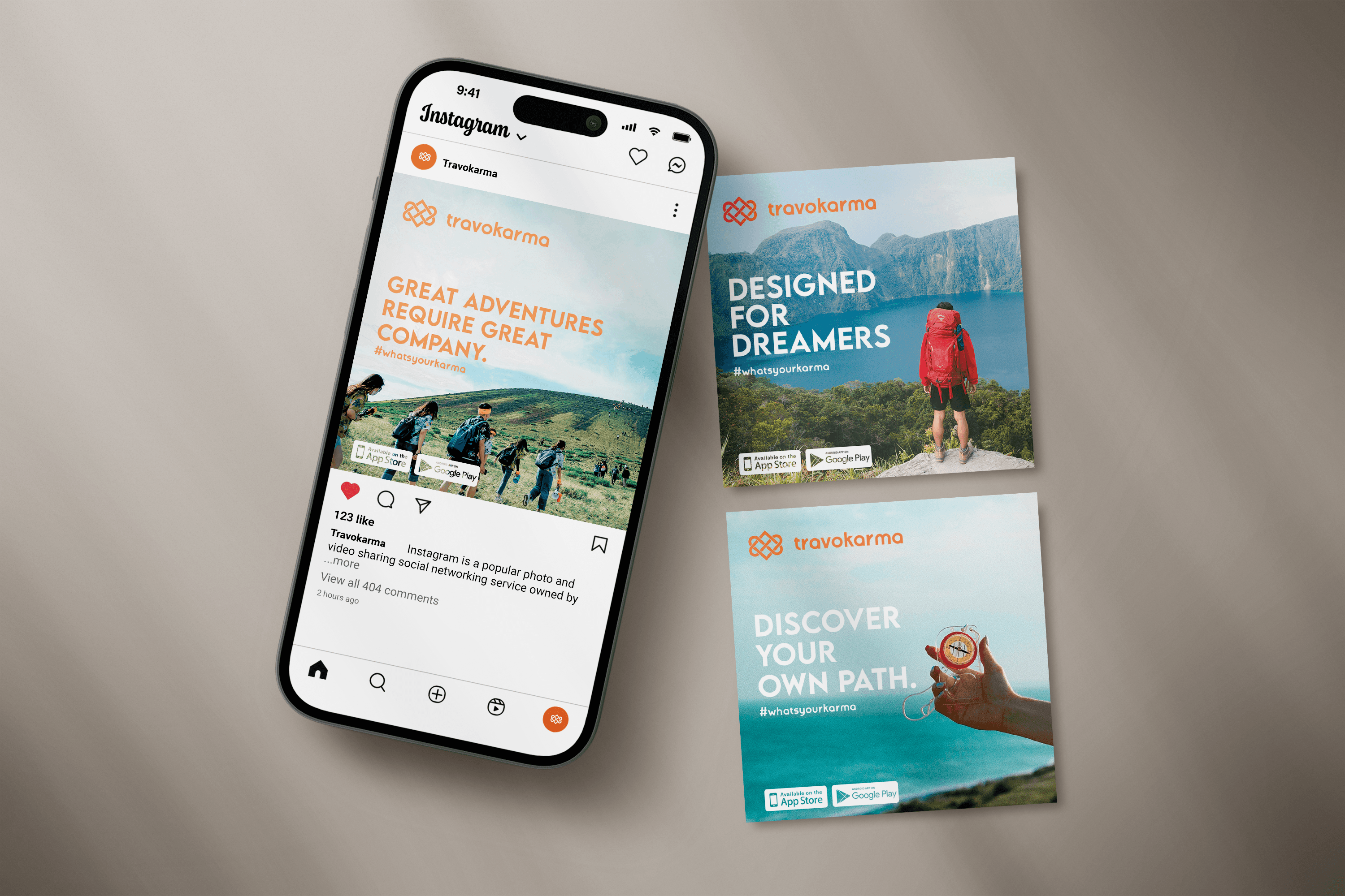
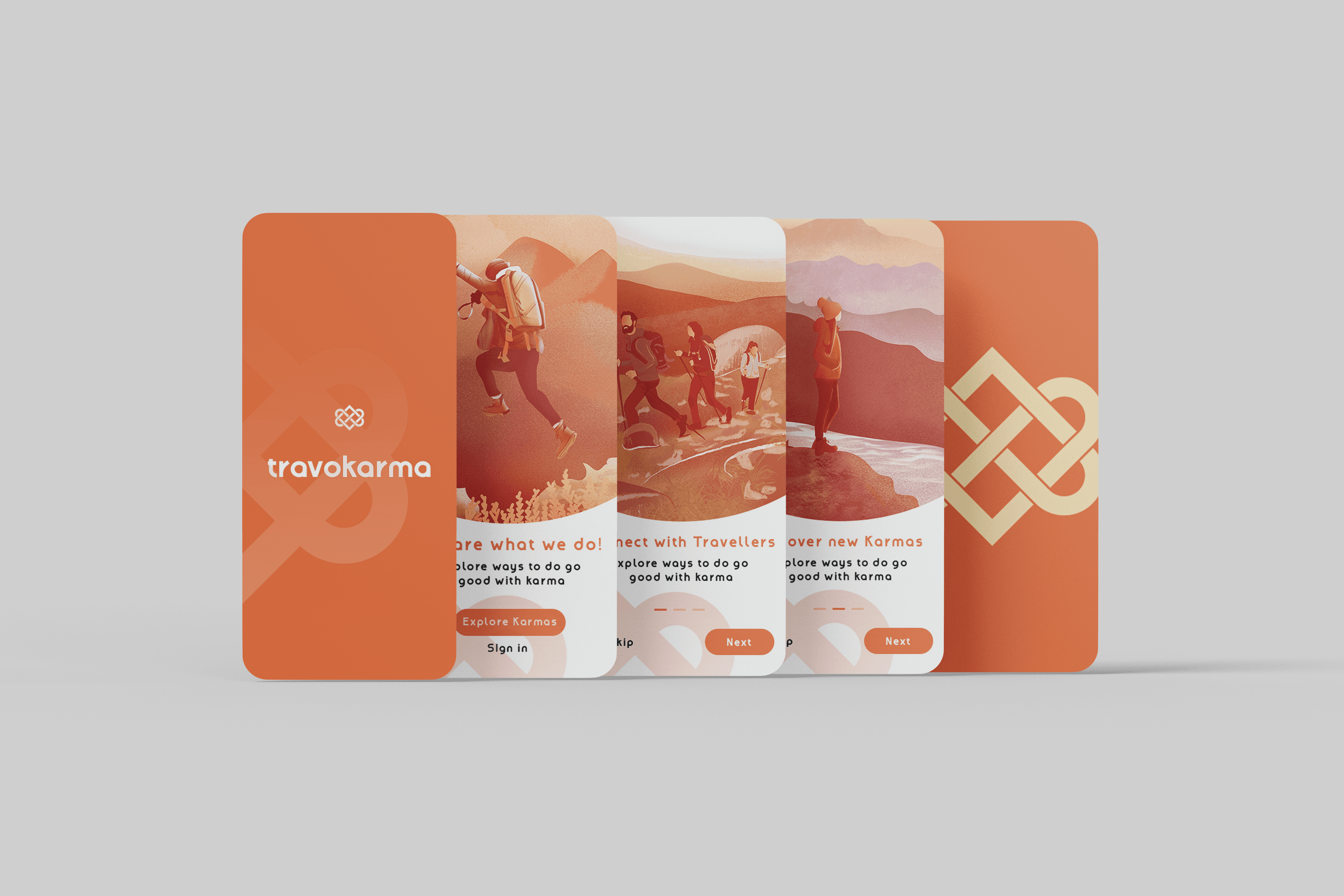
Typography features Amenable for the logo — custom, bold, and full of character — paired with Lemon Milk, a clean display font for headers and content. Brand imagery emphasizes simplicity, adventure, and cultural connection, while illustrations use monochrome minimalism to keep the system adaptable. UI/UX direction and social design were crafted to carry this tone forward — clear, vibrant, and impact-first. Every piece reinforces Travokarma’s role as a travel brand that doesn’t just help people move — it moves them.mobile.