Designing a values-led identity for a grassroots NGO focused on knowledge, dignity, and community growth.

Brand Philosophy & Strategy
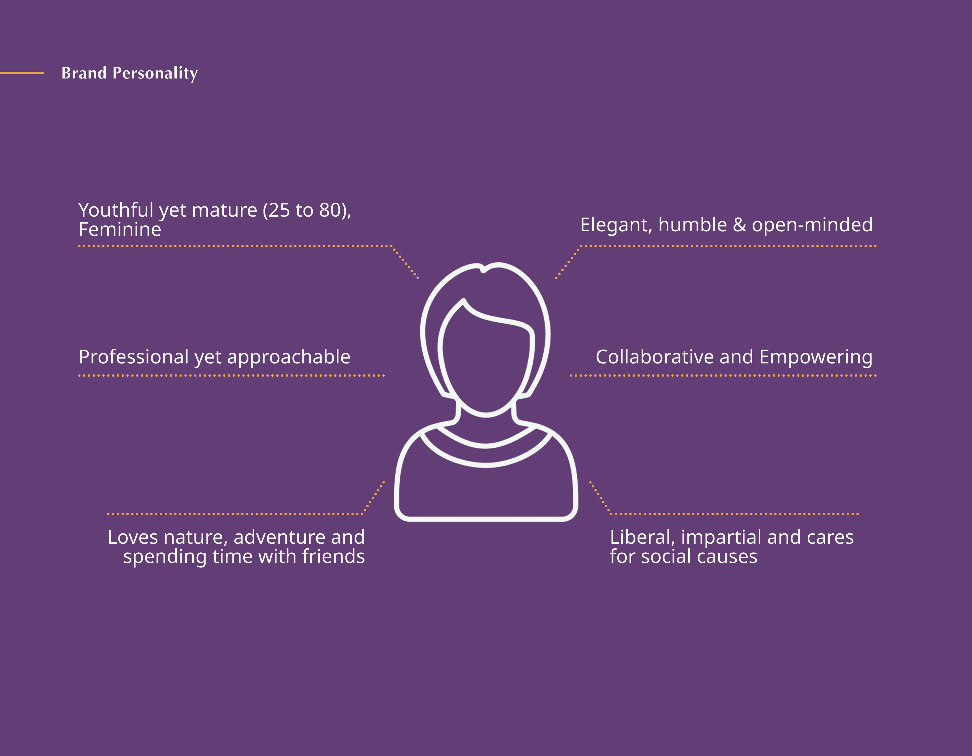
Jnana Foundation is a non-profit organization dedicated to empowering marginalized communities through access to knowledge, learning resources, and socio-emotional support. The identity was designed to reflect the organization’s deep-rooted belief that dignity begins with understanding — that awareness, education, and compassion can spark long-term societal change. The strategy centered on building a brand presence that feels both grounded and uplifting — able to speak to communities on the ground while maintaining the credibility needed for institutional partnerships. The tone is warm, inclusive, and quietly confident, anchoring Jnana as a trusted guide in the space of education and empowerment.


Visual Identity & Execution
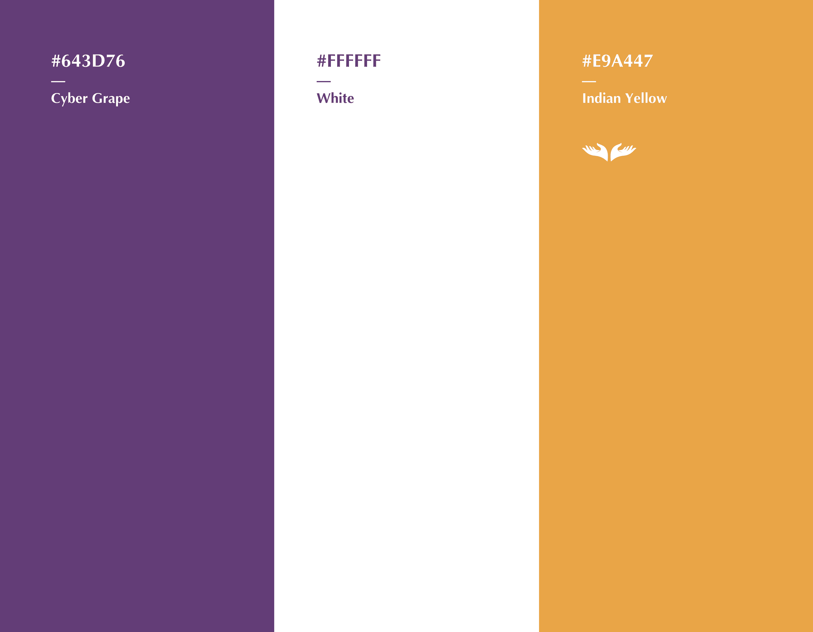
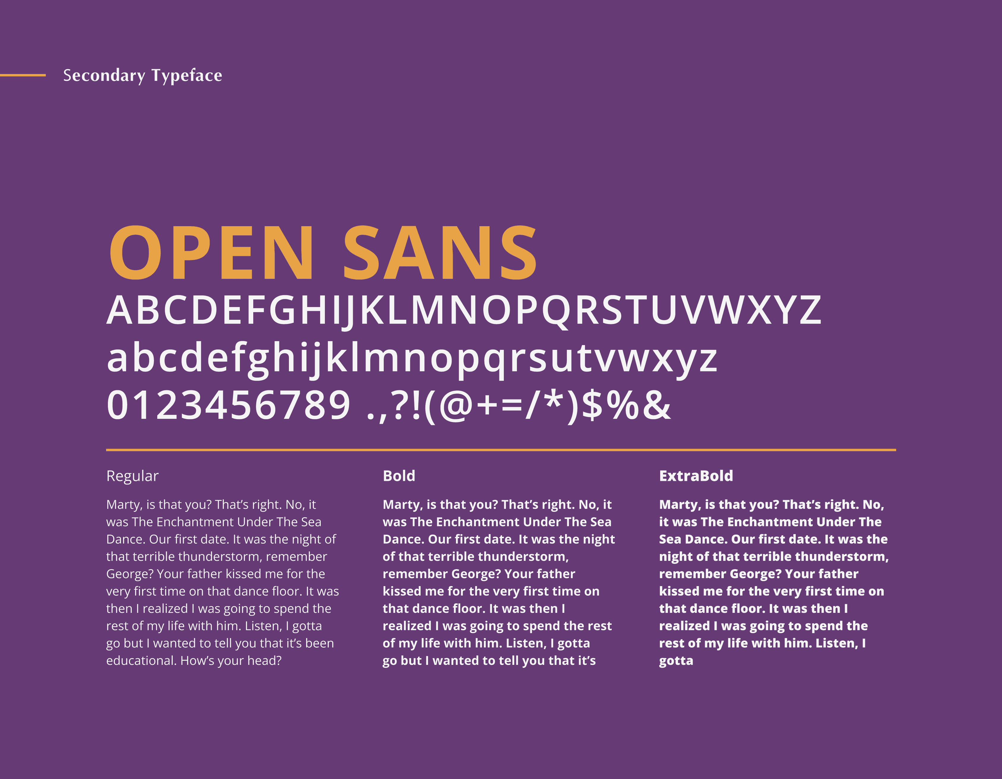
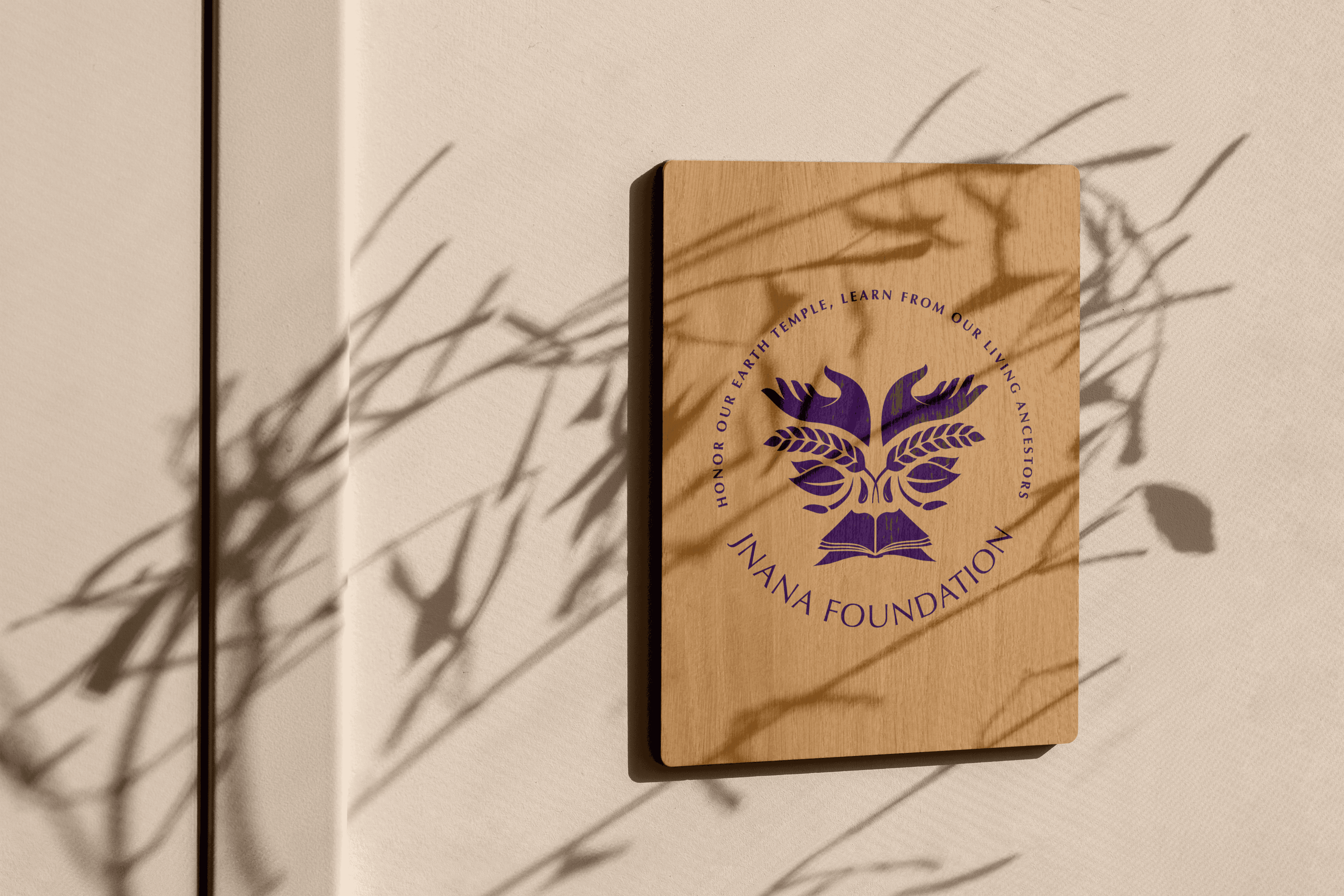
The identity system is anchored by a symbol inspired by open books, sunrays, and interconnected growth — reflecting Jnana’s core values of learning, light, and community. The logo is designed to be simple and scalable, allowing it to live comfortably across both digital and print applications. The color palette blends earthy tones — warm terracotta, soft cream, and a calm indigo — evoking trust, care, and approachability. Typography choices prioritize accessibility and clarity: a humanist serif brings warmth to headings, while a clean sans-serif supports informational content. Overall, the brand system is built to be flexible, empathetic, and rooted — much like the communities Jnana serves.